Sandbox Therapy -
A Visual Storyline
UI Design | Freelance Website Redesign & Illustration
Situation
Sandbox Therapy Group is a group in Seattle, Washington that provides psychological assessments and treatments for a wide range of emotional, thinking, behavioral differences in individuals. This company website’s primary objective is to motivate people to learn about themselves through therapy, take assessments and enroll in therapy treatment.
As a visual designer with a keen interest in UX design, I sought to explore ways to provide a visually pleasing and stimulating user experience when searching for therapy treatments.

Task
In this project, I worked as the visual designer. My key responsibility was to redesign and develop a new site, and oversee the overall design.
The catch? I needed to finish all of the designs in 3 weeks. Although, an extremely short period of design time I quickly began my design process.
I began the project by meeting with the client and using the power of design thinking - incorporating most of the five fundamental stages, namely Empathize, Define, Ideate, and Prototype. I did not have the opportunity to test.
Sandbox Therapy Previous Site - Homepage
Action
Ideate Design Solutions Based on Website Targeted Audience
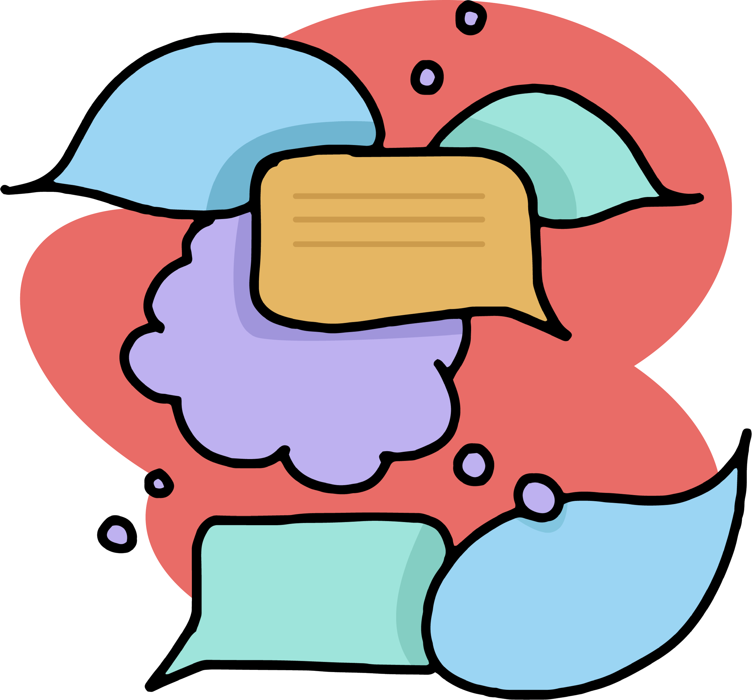
In response to the client's brief, I embarked on crafting a design tailored for children, yet equally captivating for adults.
Initiating the creative journey, I delved into sketching diverse illustrations, each thoughtfully conceptualized to resonate with the playful spirit sought by the client. Through this process I let my pencil draw while keeping in mind the playfulness a child might have. I tried keeping the corners rounded and soft to give an approachable feeling throughout.
This approach ensured a harmonious fusion of elements, resulting in a design that not only captivated its intended youthful audience but also resonated profoundly with adults.


Color
When selecting the color palette for this brand, I conducted basic user research to understand the preferences and perceptions of our target audience. I gathered valuable insights into the visual preferences and psychological responses of our users to different color combinations.
With a focus on creating a memorable and engaging user experience, I chose bright and contrasting colors that evoke positive emotions and facilitate intuitive navigation. By ensuring that these colors complement and enhance each other, I aim to establish a cohesive visual identity that resonates with Sandbox Therapy users and effectively communicates the company’s brand.


Color + Illustration
Below are the flat PNG’s of some of the illustrations, digitalized and with color.


Flat PNG’s of my Artboards
Below are the flat PNG’s of some of the artboards where I combined the finalized illustrations with my simply designed website.


Results
I was able to complete the designs in the short amount of time given to me. Now the site is being developed by someone else.
Here’s a link to my basic prototype. Due to time constraints the prototype is simple.
Below are simple “before and after” mockups, thank you reading!
Before and Afters


