Intrust Funding - A Website Redesign
Overview:
UX/UI Design | End-to-End Company Website Redesign with a focus on Increasing Website Traffic
Role:
UX/UI Designer
Timeline:
January 2022 - June 2022
Situation
Intrust Funding is a small hard money lender based in Bellevue, Washington. This company website’s primary objective is to motivate people to become passionate about investing in real estate, obtaining a hard money loan, and to educate experienced and new real estate investors. The overall goal was to increase website traffic and gain a higher conversion rate.
As a visual designer with a keen interest in UX design, I sought to explore ways to provide a simple and efficient user experience when learning about hard money loans and, similarly, obtaining one.

Task
In this project, I worked both as a Visual and UX designer. My key responsibility was to redesign and develop a new site, and oversee the overall design. I began the project by using the power of design thinking, incorporating the five fundamental stages, namely Empathize, Define, Ideate, Prototype, and Test.
Intrust Funding Previous Site - Homepage
Action
User Research
To initiate the research phase, I sent out a survey to some of Intrust Funding’s previous borrowers. This survey covered the entire company image as well as the website and usability. Although only five borrowers responded from the borrower base it still allowed me to begin a deeper research on Intrust’s investors. This enabled me to unravel key user pain points.
User Journey Map - Initial Site
From the borrowers survey and site analytics (viewing clicks and user tracking) I created a user journey map as a way to understand the site visitors pain points, journey, and possible thoughts while on the site.
Below are some of the big pain points I discovered.
Pain Points From Intrust Funding Borrowers
Too Much Text
Feedback from the borrowers suggested that the amount of information caused eye strain and one borrower said upon landing on the site it was an immediate deter. Furthermore users wondered what made Intrust Funding different from other hard money lenders.
Although, good for SEO, the website lacked readability for the user.
Difficult Information
The information about real estate loans can be complicated and daunting.
New borrowers expressed their confusion about where to find the best information on real estate loans, loan types and what kind of ways you can use hard money for real estate investing.
Unorganized Information
Borrowers expressed frustration with the layout and organization of information. There were unclear pages and a “difficult use of the navigation”.
Help Not Accessible
Through user feedback, it became evident that there is a lack of clarity surrounding the loan draw process and the prequalifying. There was no clear way to get their questions answered.
Furthermore, users found it irritating to fill out the prequalifying form when the form was not directly available on the “Prequalify” page.
User Personas
From borrower surveys to online research to deep diving real estate hard money group chats, I began pulling together information to form the user personas for Intrust Funding.
Predicted User Flows - New Site
Based on the user personas I crafted two user flows of the prequalifying process. One looks at how experienced borrowers would prequalify and the other how inexperienced borrowers would prequalify.
Ultimately, these user flows assisted me with keeping the prequalifying process at the front of my mind when it came to site development and layout.
User Research Summary
The project began with extensive secondary research on hard money lenders, loans and all things real estate investing. I also reviewed past borrower surveys and used google analytics of the initial site to understand user habits when visiting the site. Qualitative research was primarily utilized to address fundamental questions such as "What are the user's primary needs?" and "Why are they essential in the first place?"
Initially, I presumed that most users would be confused by the information provided on the site but would find the prequalifying process simple. It was correct that the user found the information overwhelming but incorrect in the fact that the prequalifying process was simple and easy.
This prompted me to question how an updated website could benefit both new and experienced investors.
Ideate Design Solutions
After gathering helpful insights from my user research I began ideating design solutions to solve the users problems.
Competitive Feature Analysis
I conducted a competitive feature analysis to identify the strengths and weaknesses of competitors in the same market. This information can help identify opportunities for improvement and provide insight into what features and functionalities should be incorporated into the design of a product or service to gain a competitive edge.
After conducting a competitive feature analysis, I identified several areas where Intrust Funding could improve its user experience.
One of the key findings was many of the competitors did not offer any sort of educational resources for users.
Additionally, introducing a a new and cleaner appearance could help users pick up information and navigate the site easier.
Finally, including process information about loans, loan scenarios, and prequalifying could be beneficial to the users.
Information Architecture
After gathering insights from both my user research and competitive feature audit I began brainstorming the information architecture for Intrust Funding.
Including information architecture in the design process helped to ensure that users can easily find the information they need, reducing frustration and increasing engagement.
Paper Wireframes
Next, I took a pencil and paper and began the creation of the wireframes.
Wireframes & Results
The paper wireframes I created provided me with a visual representation of the essential functionality and site layout for each of the pages as well as the content.
They also enabled me to gain a broader perspective of the application's operation by seeing it in its simplest stages.
Illustration
During this process I also began sketching out possible illustration ideas for the site, as I was responsible both for the UX and the UI.
I chose to add Illustration to the overall website as a way to add unique visual touchpoints for Intrust Funding. The aim of the illustration is to not only engage and create a personable connection with the user but also allow visual breaks while navigating the site.
Digital Wireframes & Lo-Fi Prototype
After ideating multiple flows with paper wireframing I began creating the basic digital wireframes so I could make a functional lo-fi prototype.
Once the paper wireframes were sketched, my focus shifted to digitizing them. This allowed me to digitally visualize the layout of the content and get a realistic understanding of the user flows.
Next Steps - User Journey Map - Revised Site
Before creating another user journey map, I began updating the site with other visual changes. After this I did another user journey map.
With this, I hope to uncover further areas of improvement and brainstorm ways to solve user problems.
Mockups and Hi-Fi Prototypes
Before & After Revisions - Fix One
After finishing the second user journey map I found that it is frustrating for users to not be able to know when they will hear from the company. To fix this issue I added a time frame after prequalifying.
Another fix I implemented would be adding more information for the user to read, but in an easy to read format. So, instead of guessing the loan type, they can browse quickly what each loan type does and then make an educated decision.
Before & After Revision - Fix Two
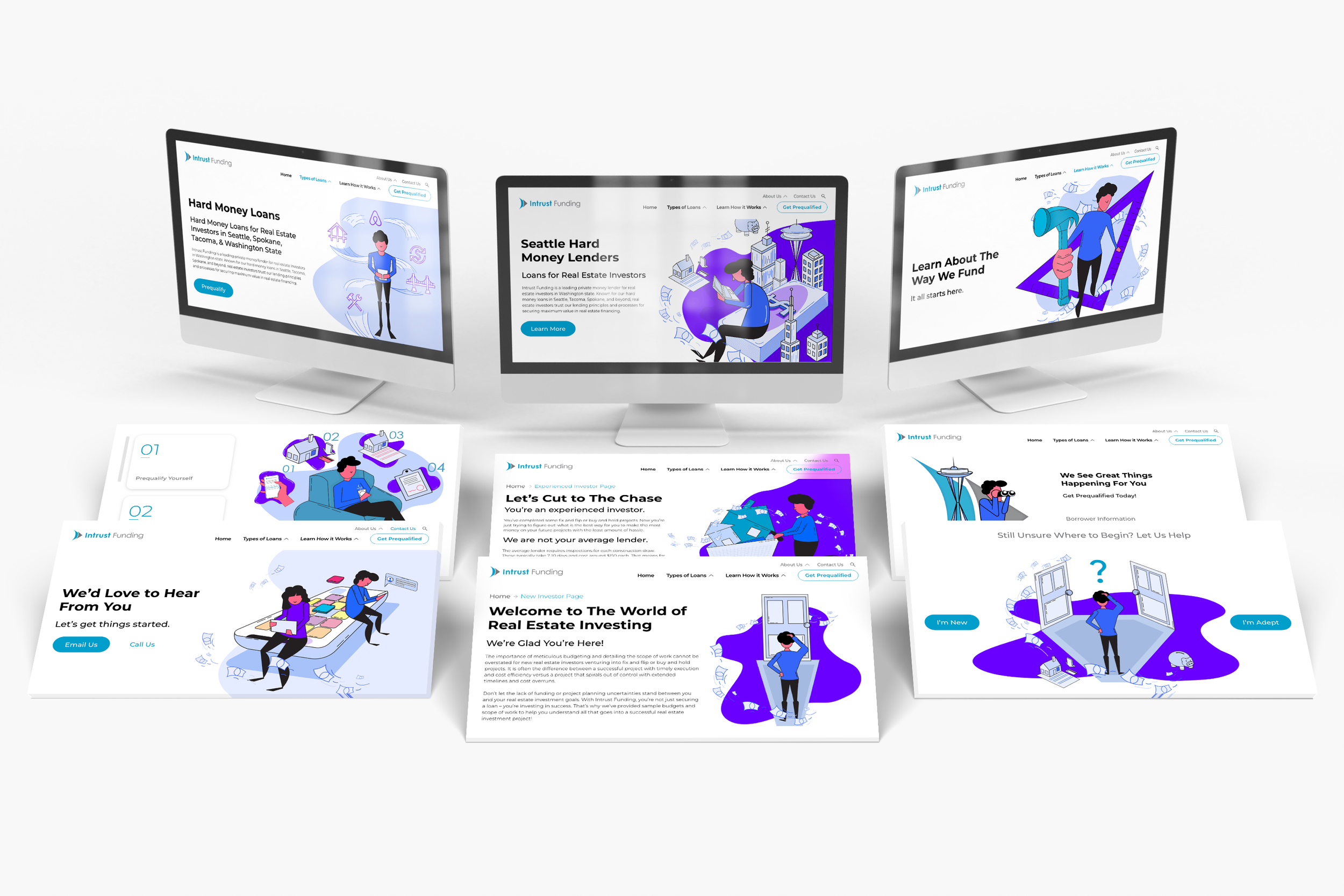
The Hi-Fi Prototype for Intrust Funding


Accessibility Considerations
High Contrast
I prioritized user experience by ensuring that there was a high contrast in the screens, making it easier for users to navigate the app and reducing eye strain.
Hierarchy
One accessibility consideration I implemented was hierarchy. Most users will scan a website and make choices based on the limited amount of time on a site. To help direct users to their goals I made sure to create reliable and simple hierarchy.
Familiar Layouts
Intrust Funding’s layout adheres to familiar gestures, icons, and flows commonly used on other websites, catering to users from diverse backgrounds.
Results
This project is still currently in process. Unfortunately, we do not have a web developer so we are slowly building this website out ourselves.
Currently, from the changes we have implemented we have seen a clean lead flow, a consistent conversion rate, and a spike in the time a user spends on the site. As more changes are implemented I hope to see more loans from digital marketing.