
First Step - Brainstorming.
Vodka, anyone?
In this project I had to opportunity to design a corporate brand. I shuffled a bunch of different corporate brands in a hat and then let fate decide which brand I would do, Notorious Vodka Co won.
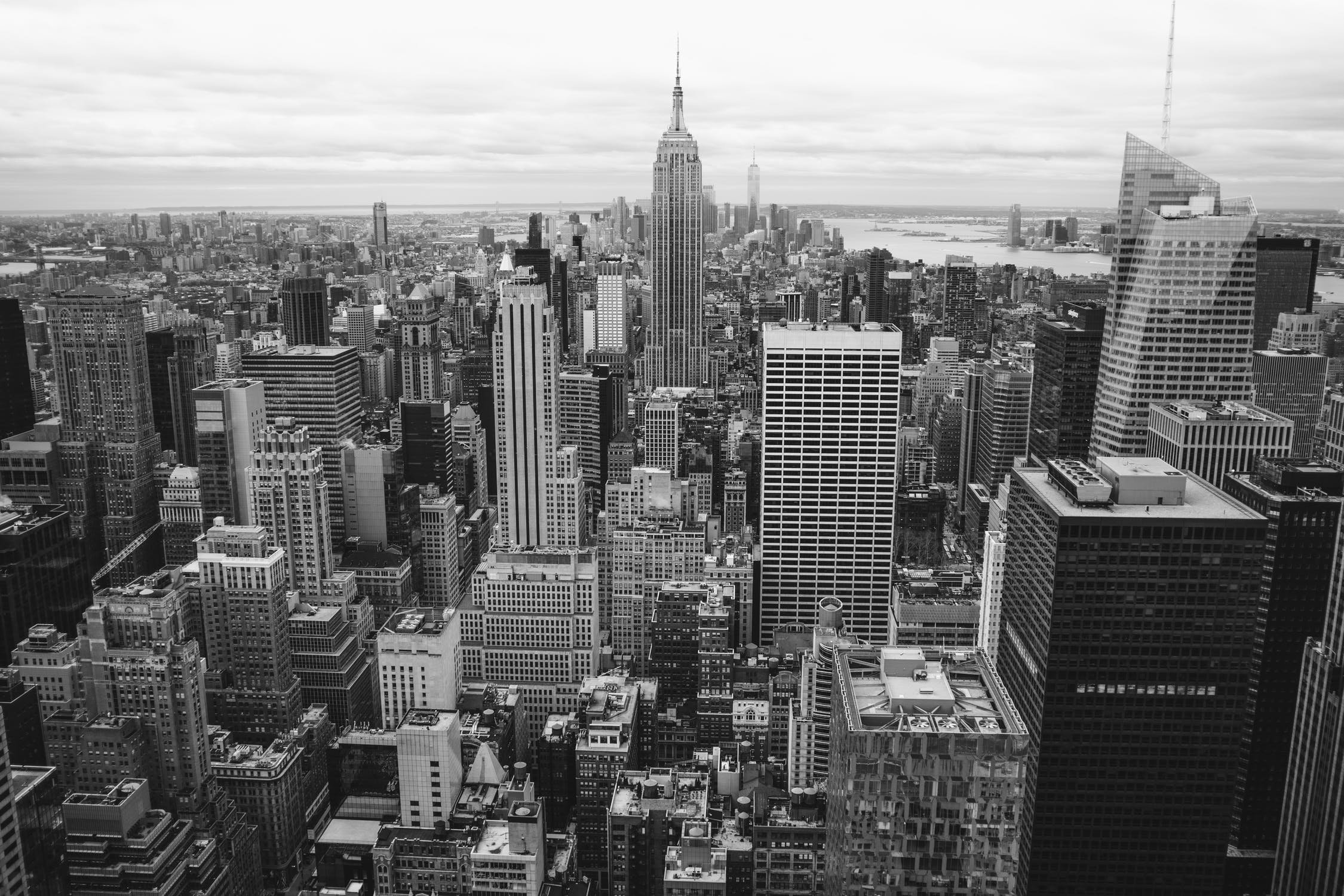
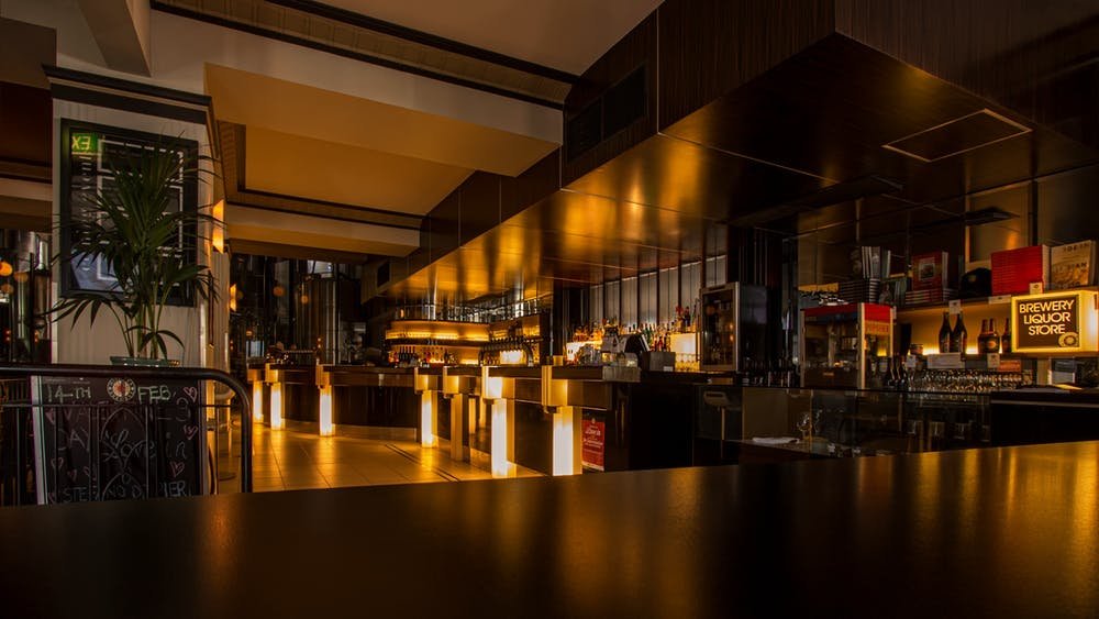
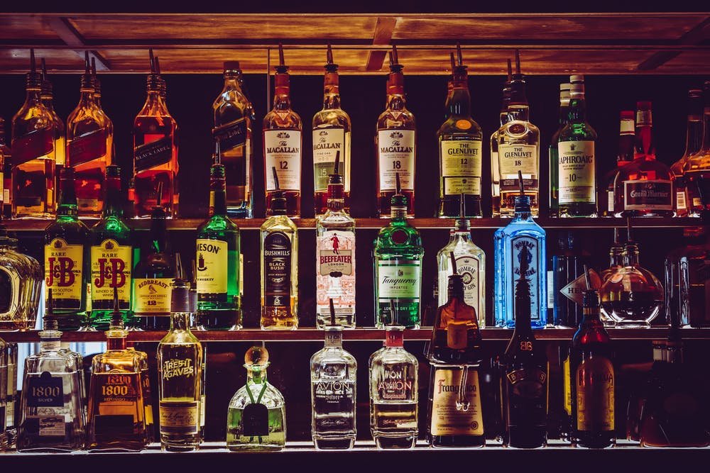
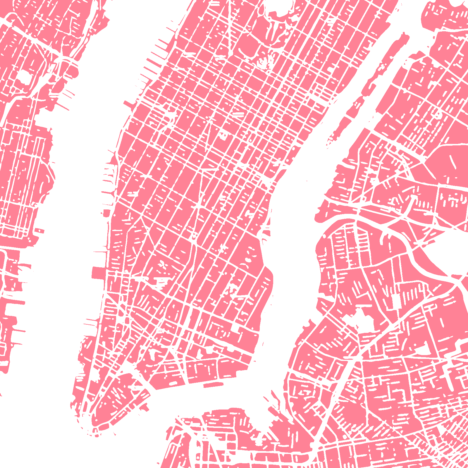
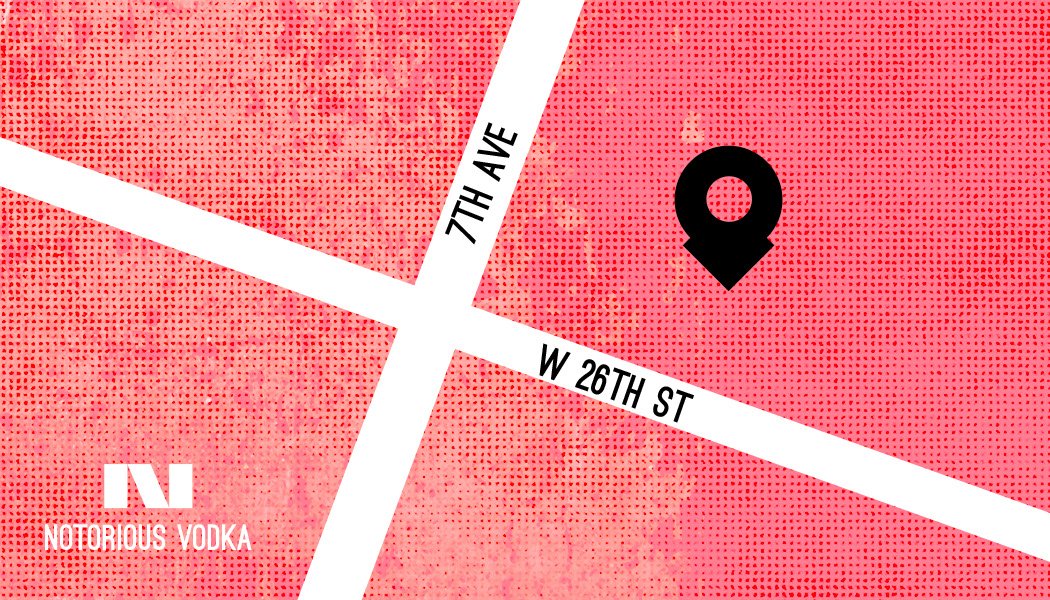
A little company background: Notorious Vodka Co. is a company placed in New York City. They distill, blend, and hand-bottle at their Chelsea micro-distillery, aiming to capture the essence of NYC in every bottle. This vodka is made to be to be enjoyed straight or in a favorite cocktail. They use a natural yeast for fermentation which delivers a subtle flavor and aroma with a clean and smooth finish to every drink. The environment at the Chelsea micro-distillery is for those looking to try and taste the vodka. The distillery offers a cool, welcoming, environment with a full-service bar and a bar and stool feel and sells the Notorious Vodka. It’s a haven for vodka connoisseurs and newcomers alike. Because this distillery is placed in New York City it knows the hustle and bustle of the city and the quick and fast paced environment. It knows New York City’s love for the night life and sipping on their favorite alcoholic drinks. It knows the famous New York City energy and the convenience of bars on every corner. It knows that New York is authentic as they come which they try to recapture with every sip of their vodka.
Pencil to Paper - Sketching Ideas.
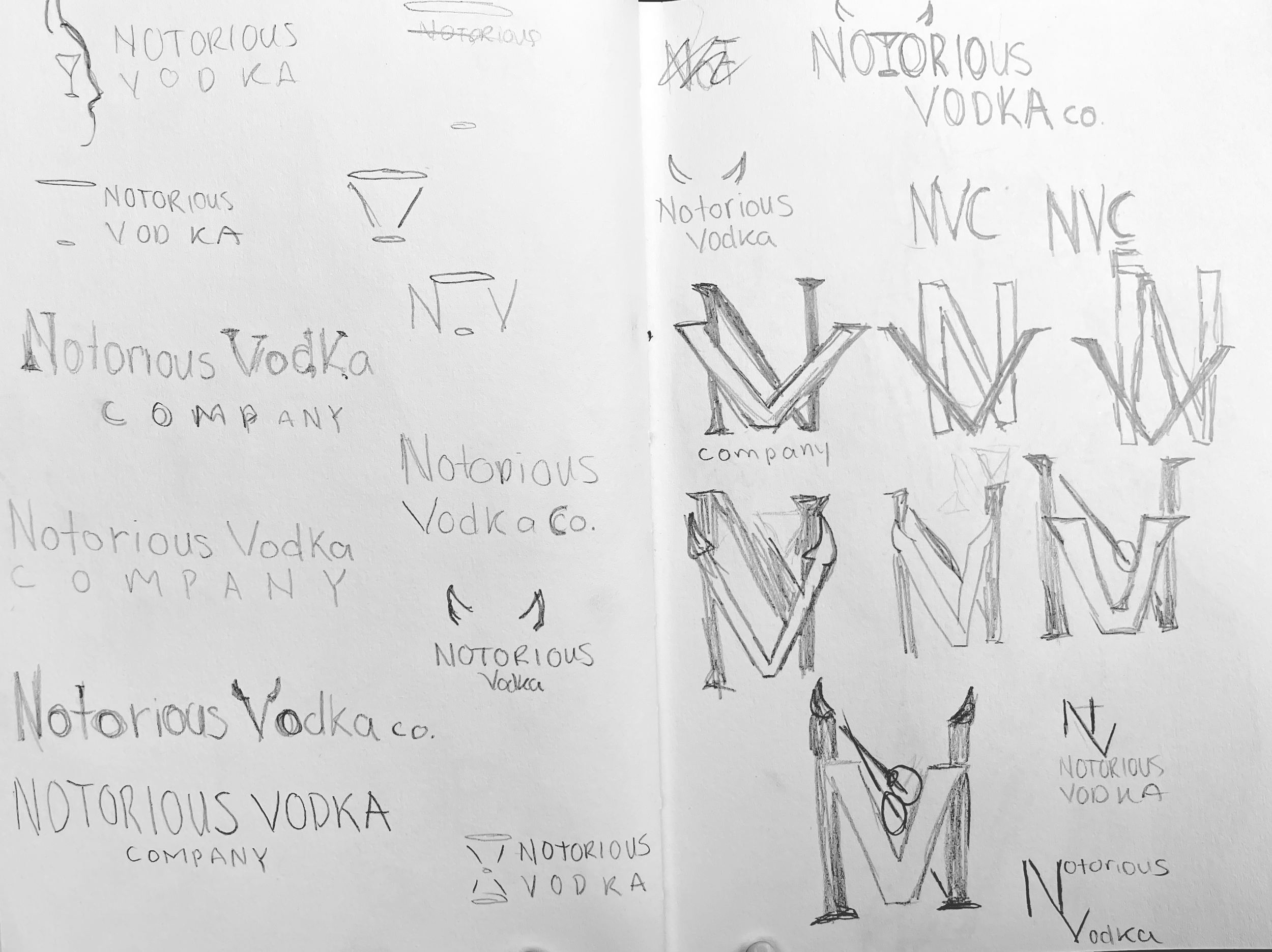
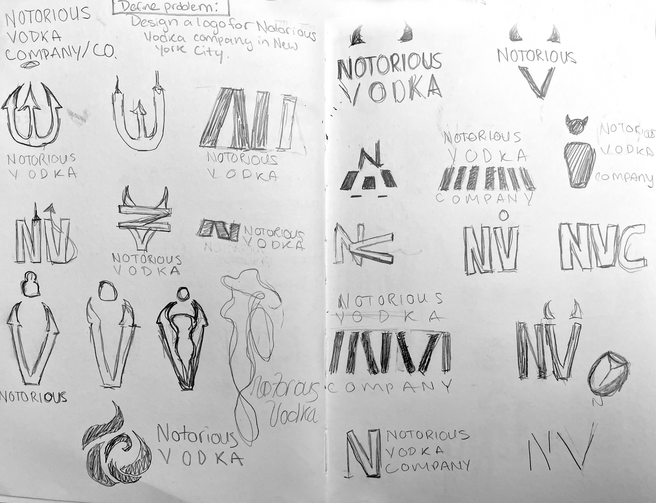
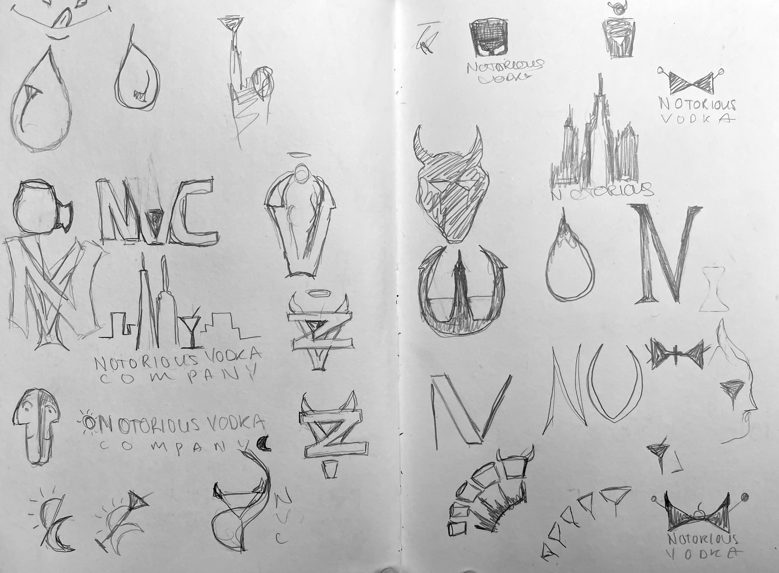
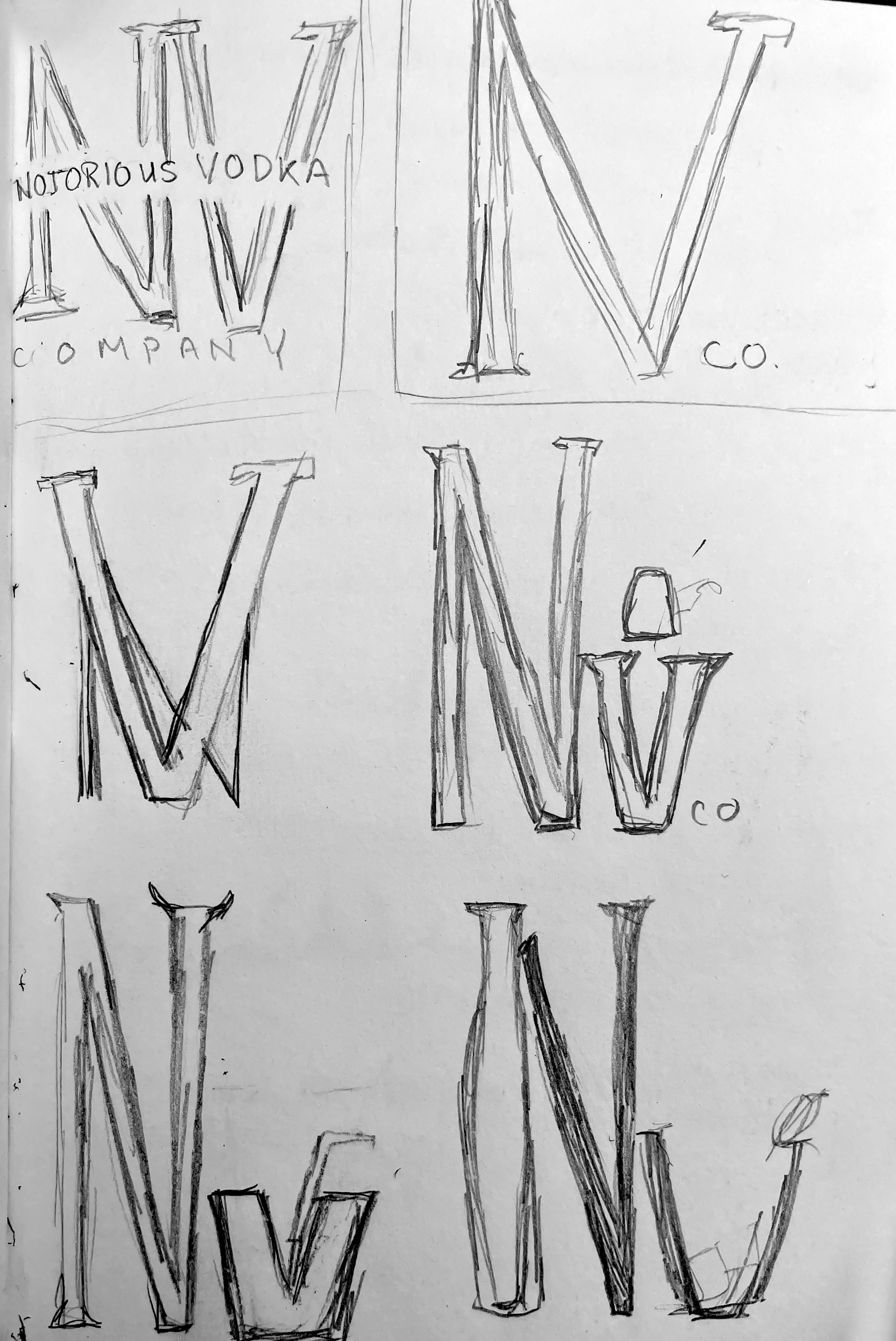
For this project I hit the ground running, or maybe my pencil hit the sketchbooks. Below are the sketches of possible logos for Notorious Vodka.
My process stays similar to this day. I like to have one of my sketchbooks nearby so I can doodle any ideas that come to mind. This way I allow myself to keep my own work original and fresh. I continuously had the words, alcohol, New York, vodka, smooth, alive, and bold in my head when working through these sketches.


Narrowing down the sketches and adding a touch of color
After sketching my little heart out it was time to choose some of my favorite sketches and turning them into vector options. This part of the process also included the search for the perfect and fitting company color.
Below are some very colorful logo options for the Notorious Vodka Company.
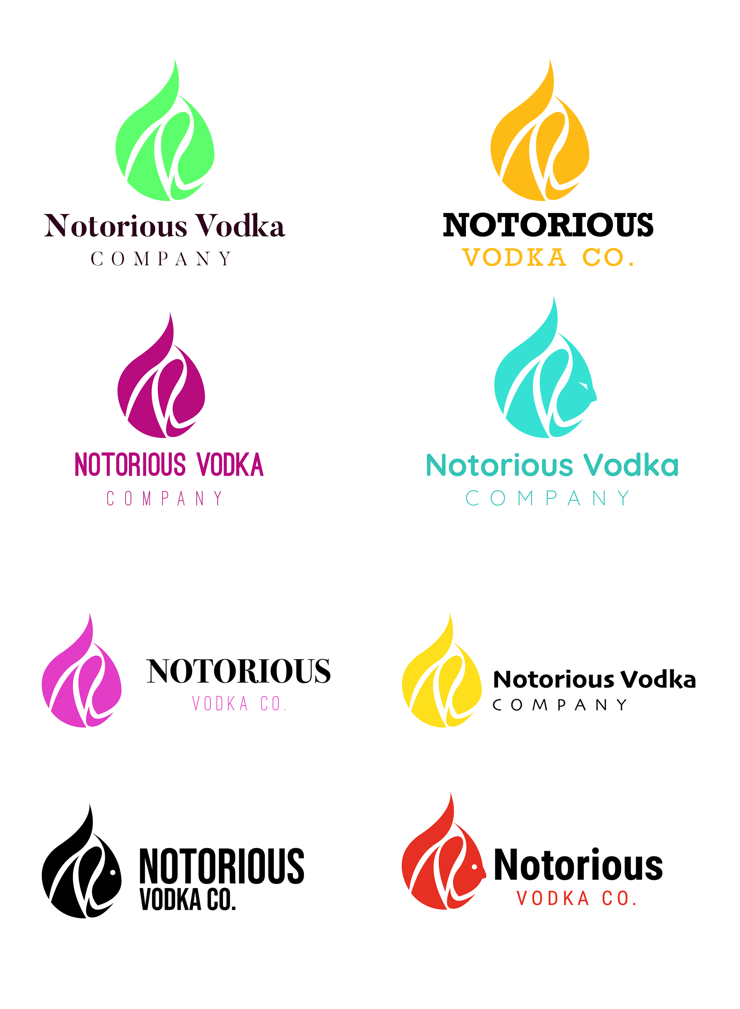
The final logo color and design.
After quite a lot of color theory and logo design I decided on the below logo as the official Notorious Vodka logo, along with the color!
In this logo I drew my main inspiration from New York and the millions of crosswalks that run across the streets. As for the color, I landed on pink because of the energy it gives off. It's bold, enduring, but also friendly and approachable. All characteristics I want the Notorious Vodka Company to give off.

Next stop: Inspiration Town
Now that I finalized the logo and colors I decided it was okay to sift through some inspirations, below are some things I found inspirational to this project. I did not create/take these.


Now, for my own creation of inspiration
After feeling the right amount of inspired I began drafting/creating my own source for inspiration and kept the question, "who is Notorious Vodka Co.?" at the front of my head.
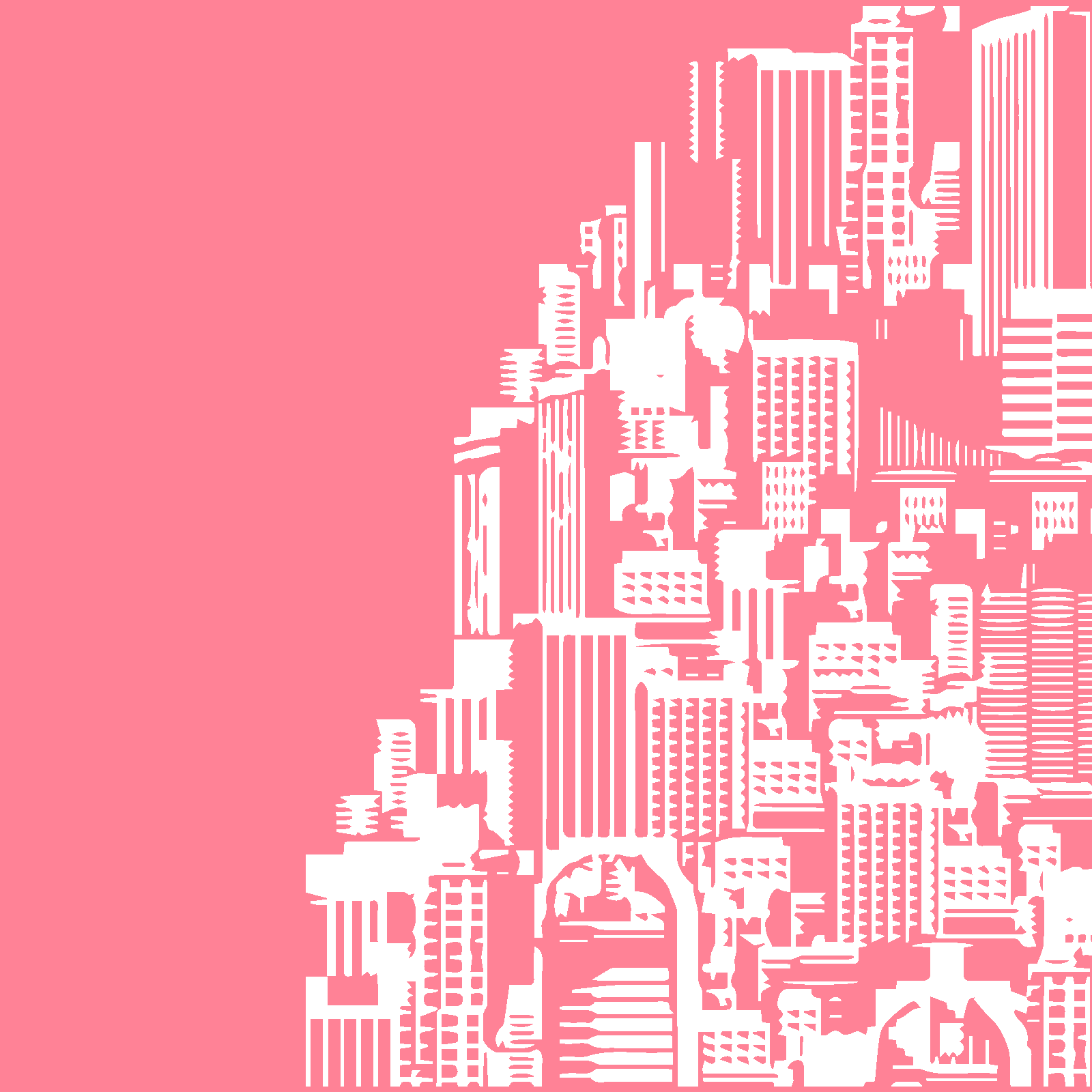
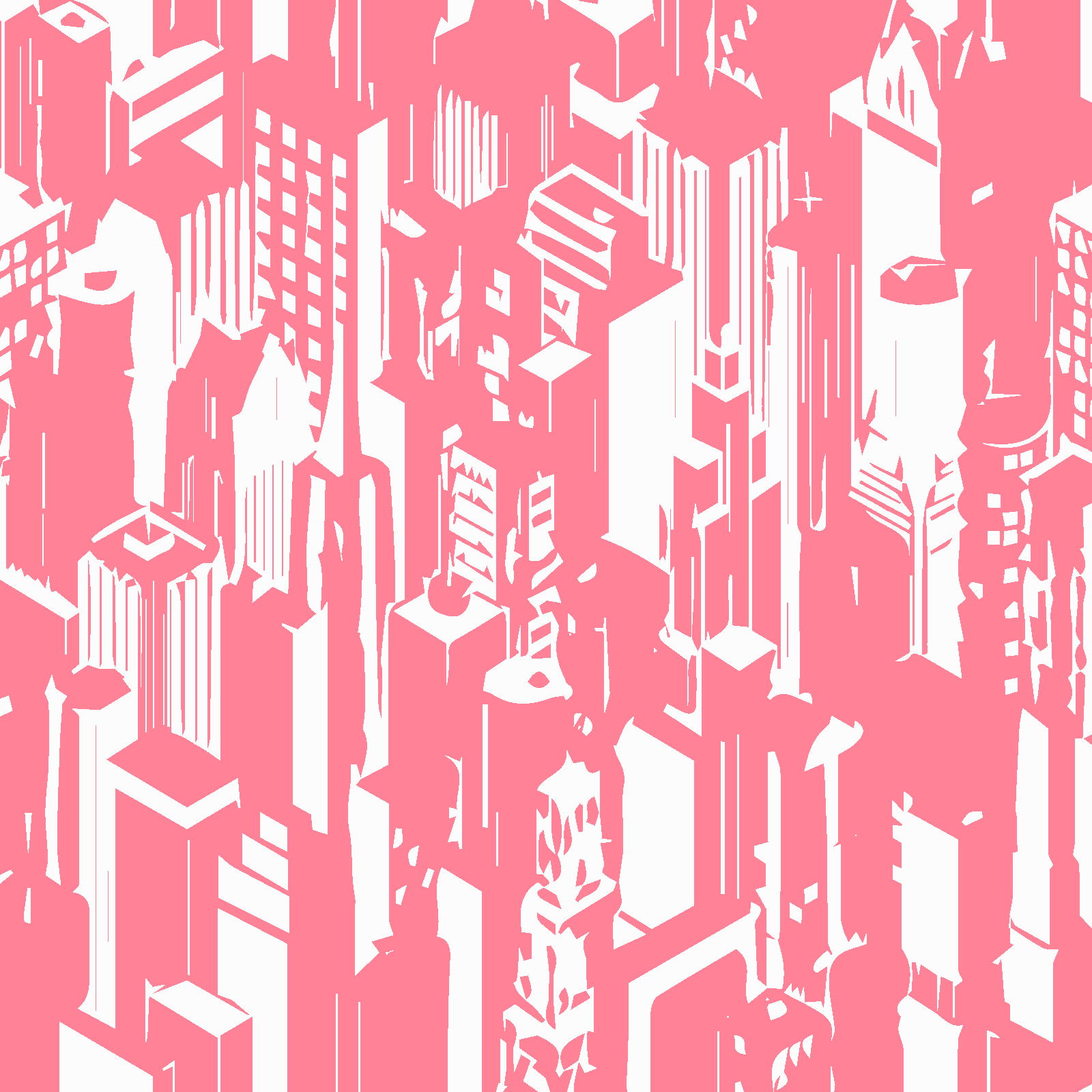
Below are various patterns I created for this project.
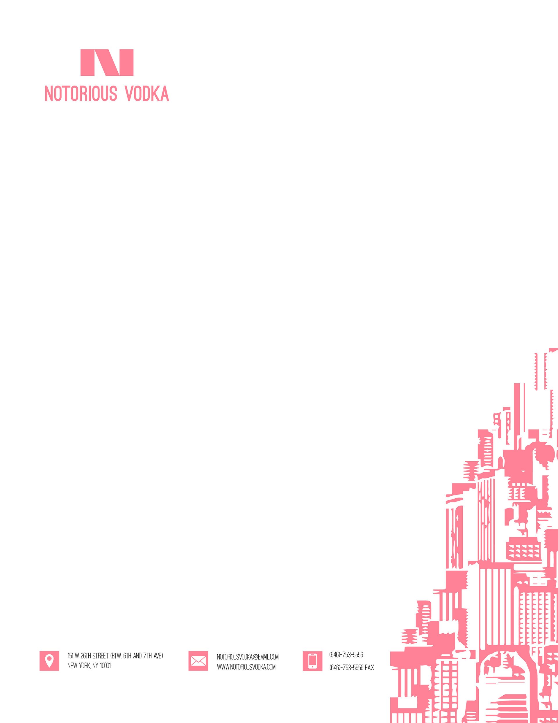
Bringing it together - flat stationary
All corporate companies need a stationary system. For this part of the project I began taking my inspirations from above and making them into business cards, envelopes, letterheads and more! I made sure to keep a consistent look, making sure the designs screamed: bold, bright, texture, and New York!
Below are the flat designs I created for the stationary. Below those is a mockup of some of the stationary items.


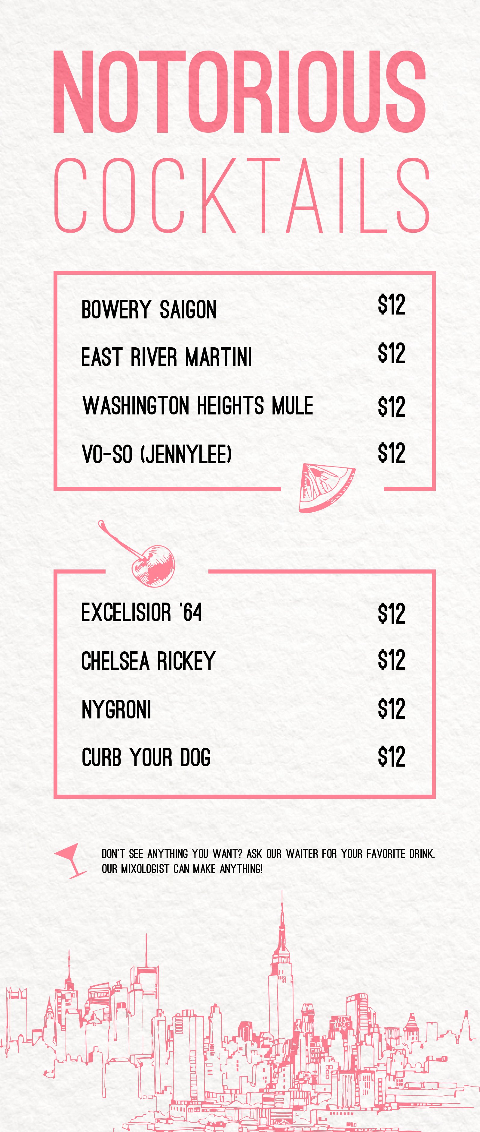
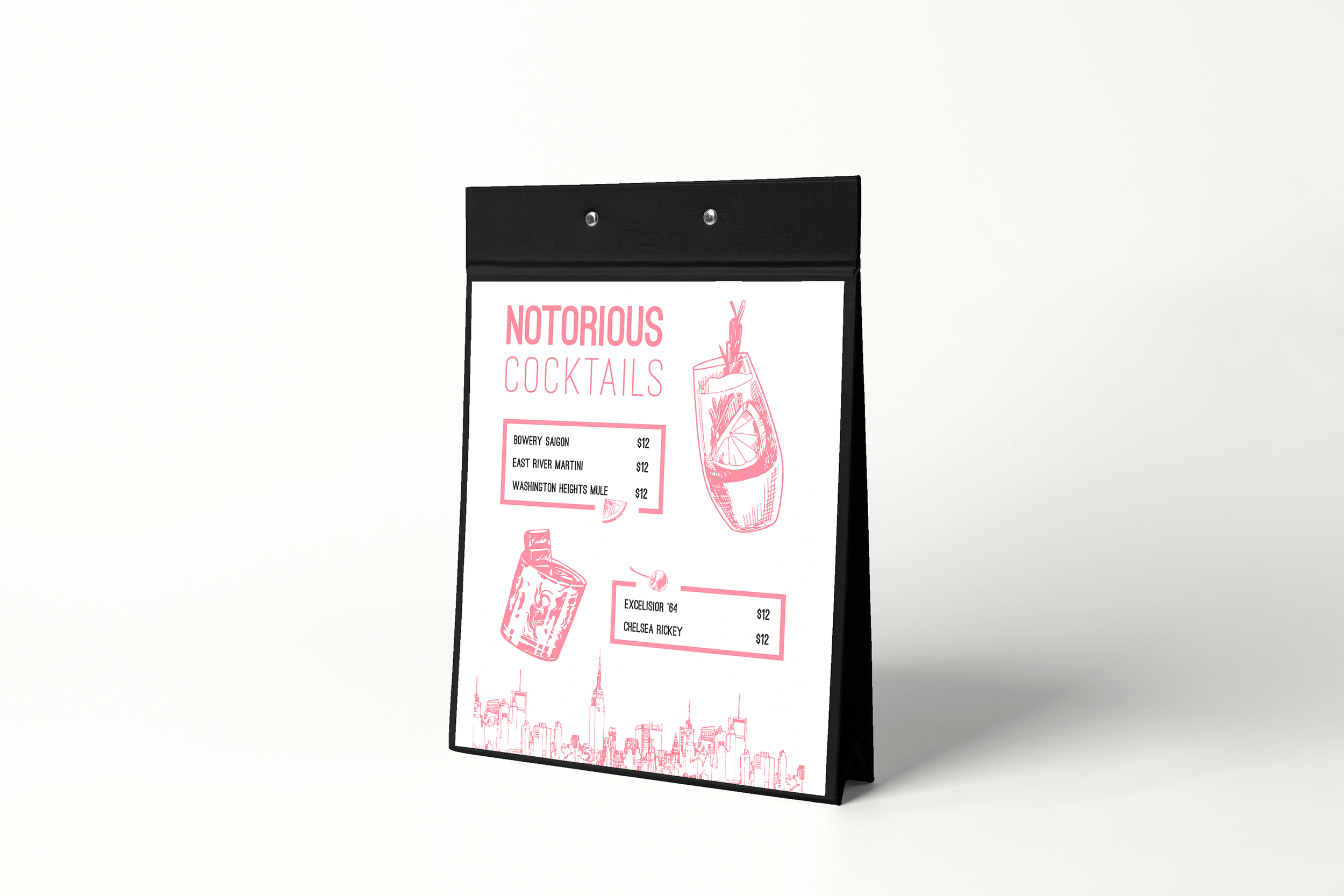
A fitting menu design
Below are both the flat designs and a small mockup of the menu for Notorious Vodka.

A Notorious Lookbook
I wanted to create a few more assets for this company. Below are some mockups of some pages I created for a Notorious Vodka lookbook. This book is simply like a magazine where the users can flip through, read, look, and learn about all things Notorious Vodka.


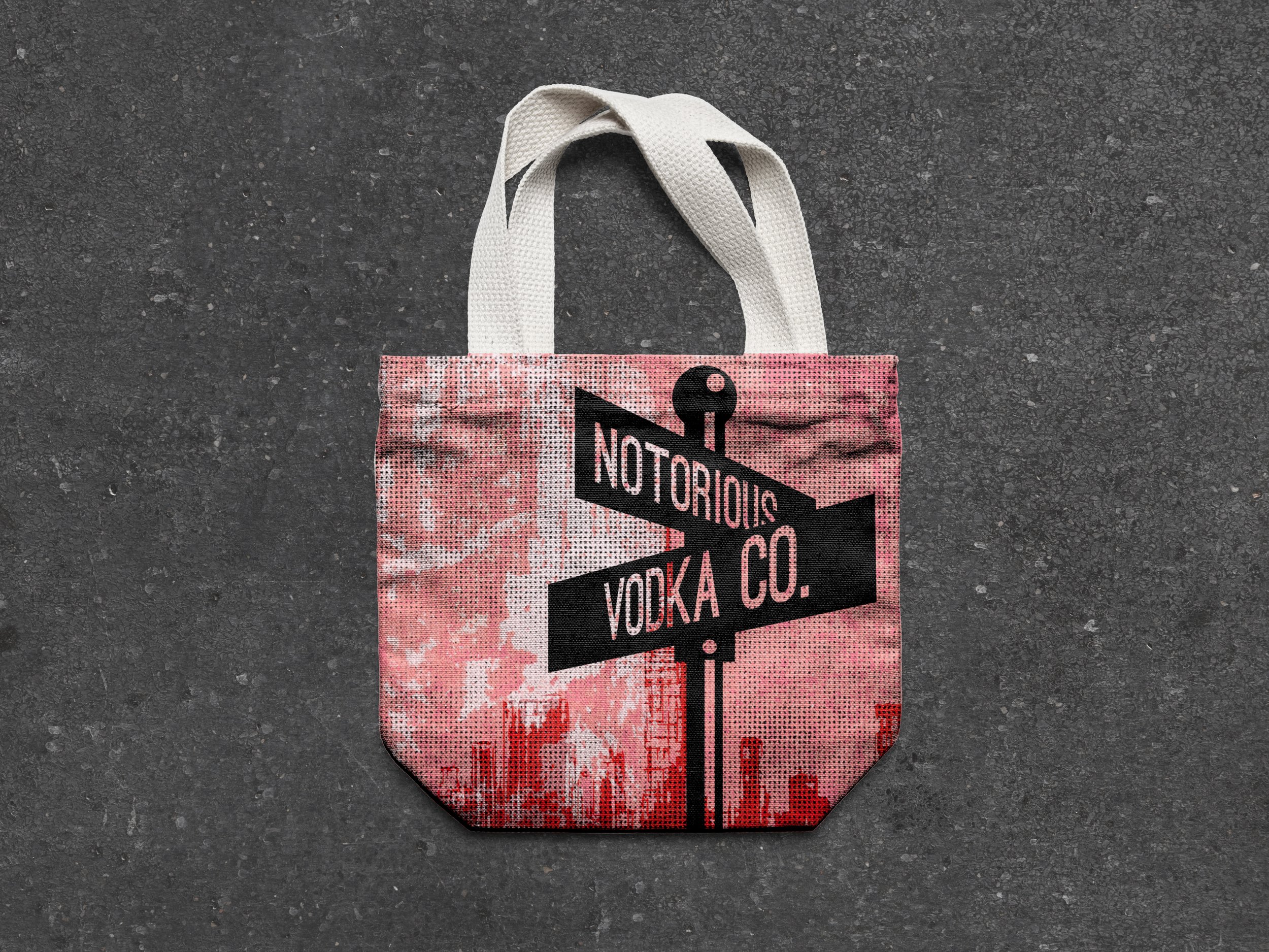
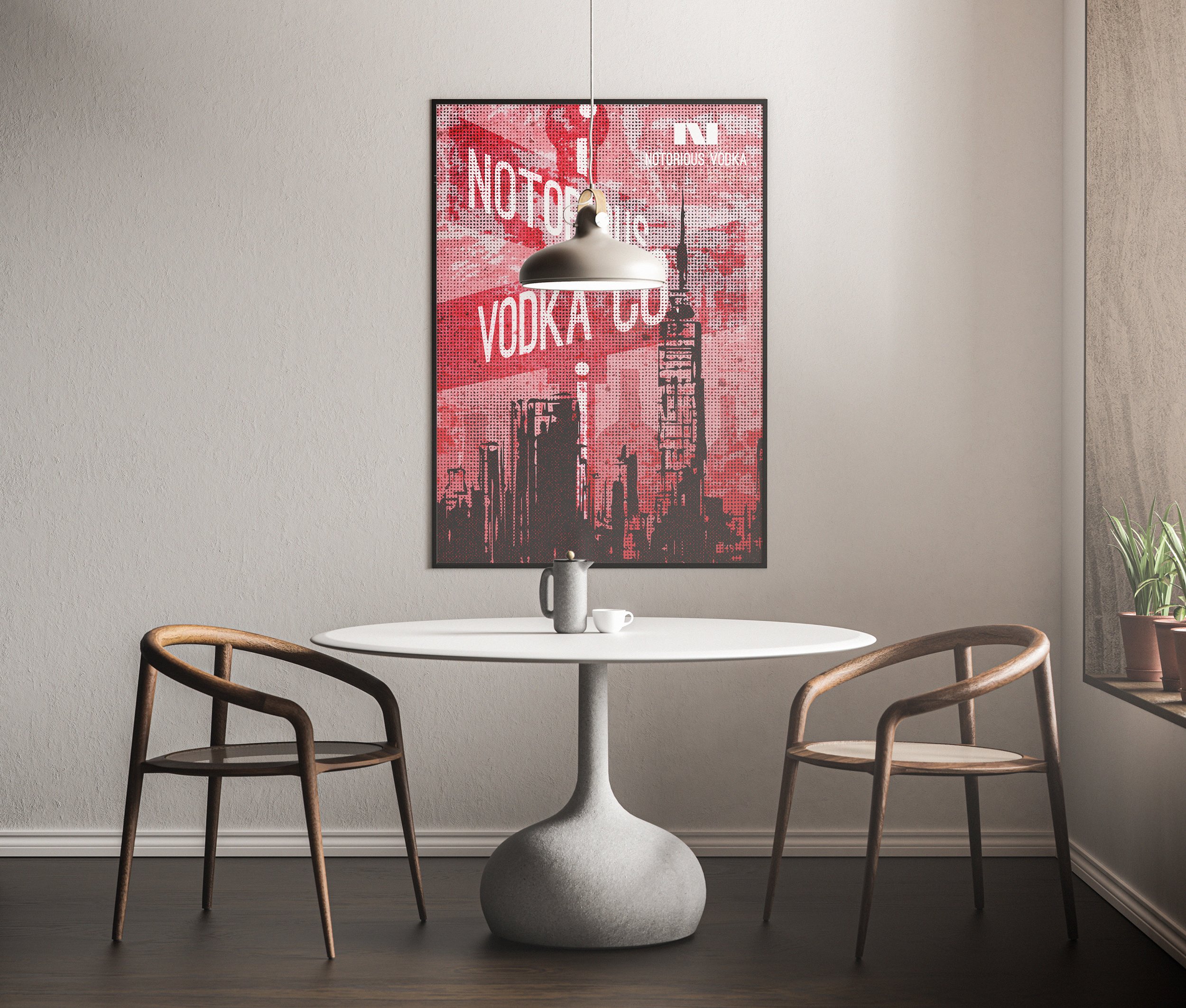
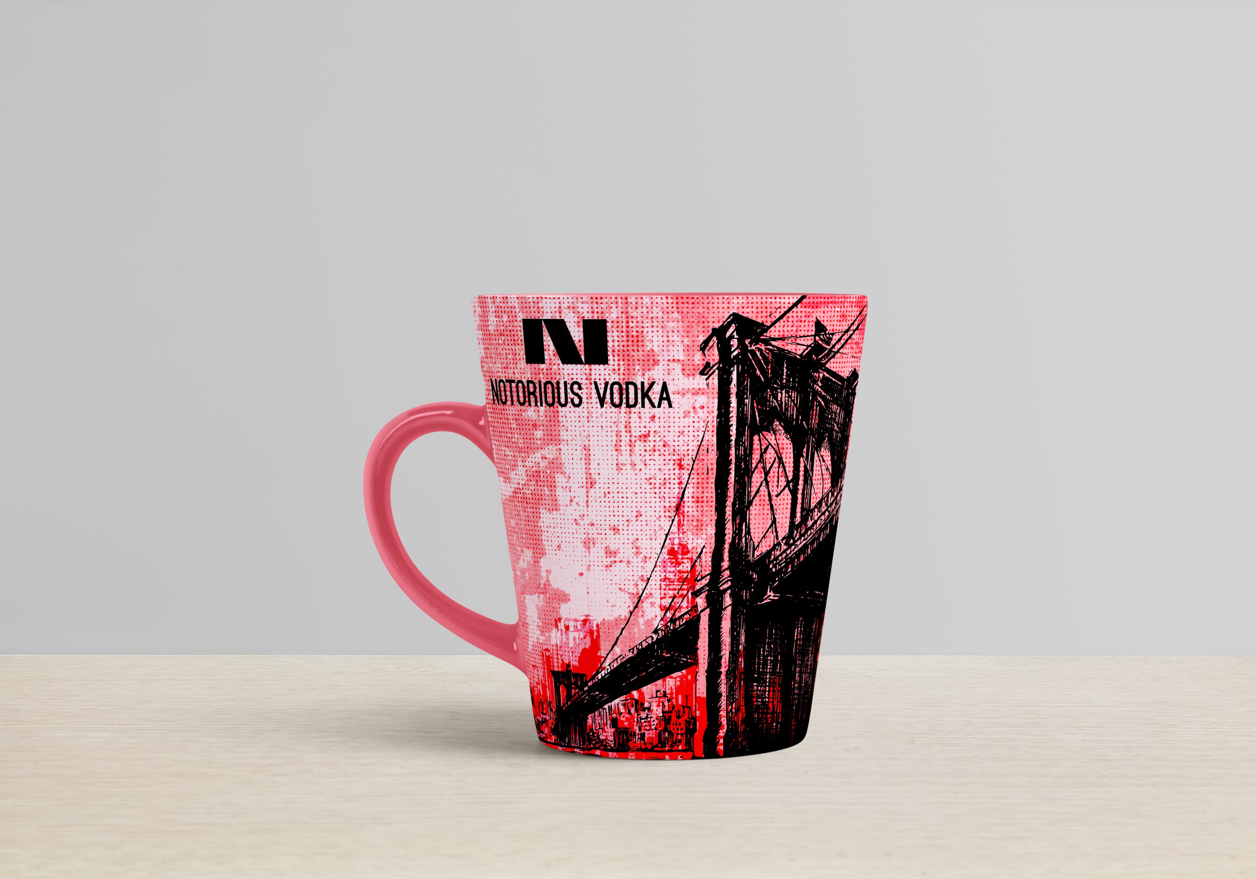
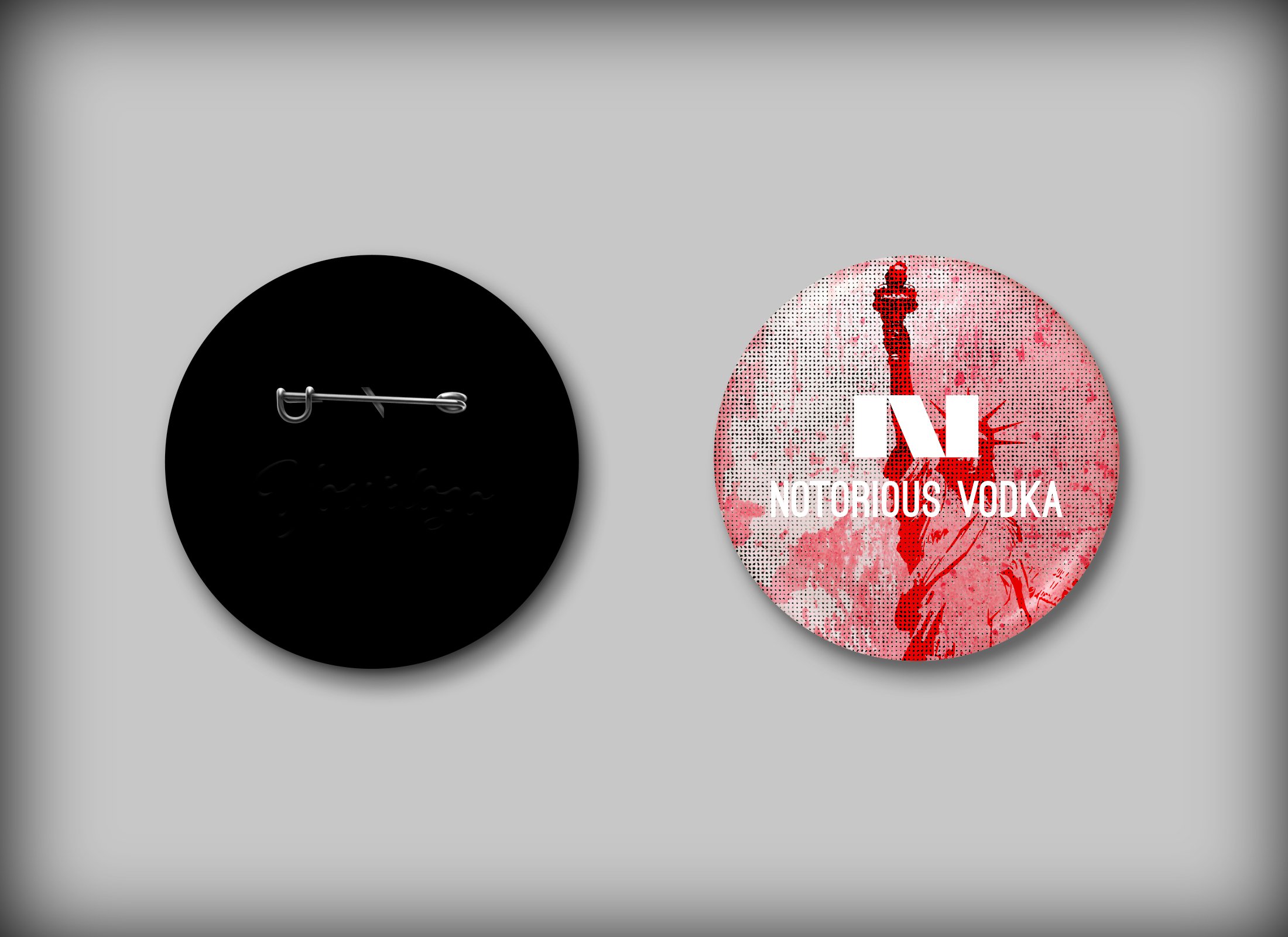
Product designs - Pink, pink and more pink
I really ran with the pink and New York theme. Below are some of the designs I placed onto product mockups. In every one I wanted to make sure to include the essence of New York City and the bold feeling of being alive in the Big Apple!


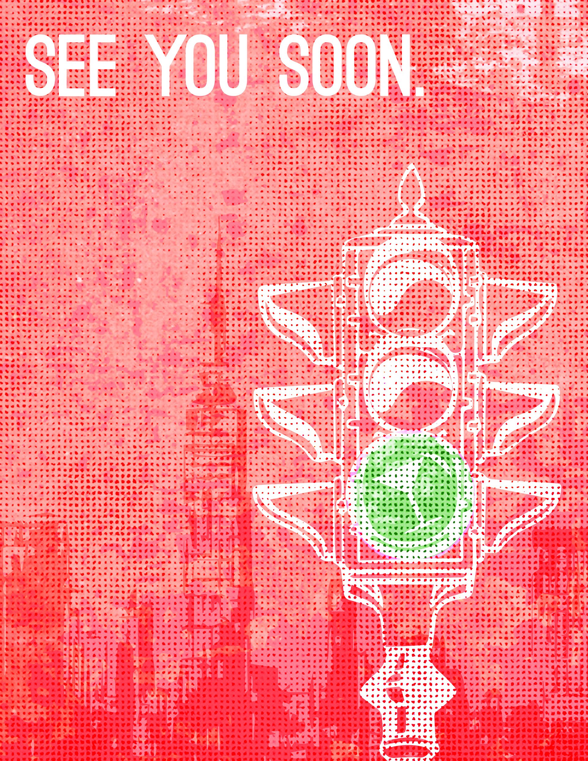
And… that’s a wrap
Thank you for taking the time to view this project. My dream is to someday be able to live in New York City, so creating these brand assets was a lot of fun and only fueled my dreams. Whatever the future may hold, I am so ready!